

Colour Matching in Flag Printing: How Pantone References Are Handled
When a brand, sports club, university or government buyer orders flags, colour is usually the first thing they check and the last thing they want to negotiate. A flag that reads slightly olive instead of forest green, or wine instead of crimson, is instantly noticeable — especially when it flies beside other flags or sits next to a logo on a sponsor board.
That is why so many customers send us a Pantone reference. This article explains what happens to that reference once it reaches a flag factory: how Pantone systems differ, how screen printing and dye sublimation handle colour, and how to give us the information we need to get close to the colour you have in mind.
Why Pantone References Matter in Flag Printing
Pantone is a standardised colour language. Instead of saying “a warm navy with a hint of purple”, a customer can say “Pantone 288 C” and everyone in the chain — designer, printer, buyer, quality inspector — is looking at the same target. For flags, which are often printed in runs and reordered months or years apart, having a written reference is the difference between a repeatable result and guesswork.
What Pantone does not do is guarantee that a colour will look identical on every material. It is a reference point, not a promise, and understanding that distinction makes the whole process smoother.
Pantone Is Not One System
One of the most common sources of confusion is that “Pantone” refers to several different libraries. They are not interchangeable.
- Pantone Solid Coated (PMS C): Ink-based references printed on coated paper stock. Widely used in graphic design and in screen printing, where thick ink is laid onto a surface.
- Pantone Solid Uncoated (PMS U): The same reference numbers, but printed on uncoated paper so the ink absorbs differently. Colours usually appear slightly duller.
- Pantone Textile (TCX and TPG): References developed specifically for dyed and printed textiles. These are the closest thing to a native language for flag fabric.
If a brand guideline lists a coated ink reference, we can still work from it — but we will often cross-reference it to a textile equivalent so the ink or dye behaves predictably on polyester or nylon.
From Pantone Reference to Printed Flag: The Workflow
1. Artwork and reference review
We start by reviewing your file and the Pantone numbers you have supplied, along with any brand guidelines. If a design uses gradients, photographs or metallic effects, we will flag those early, because they behave differently from flat spot colours.
2. Choosing the printing method
The method determines how colour is created. Screen printing lays opaque ink onto the fabric. Dye sublimation turns solid ink into gas, which bonds into the fibres of the polyester. Both can hit a Pantone target closely, but they get there in different ways.
3. Colour preparation
Our team prepares the ink or dye formulation against your reference, taking into account the fabric being used, whether the flag is single- or double-sided, and how the flag will be viewed — backlit, indoors, or outdoors in strong sun.
4. Proofing and approval
For larger or colour-critical orders, we can produce a physical proof or strike-off so you can view the colour on the actual fabric rather than on a screen. This is the single most useful step for anyone who needs confidence before a full run.
5. Production and checking
Once approved, the job runs under our strict quality control, with checks against the agreed reference at key stages.
Screen Printing vs Dye Sublimation
| Method | How colour is created | Typical colour behaviour |
|---|---|---|
| Screen printing | Opaque ink pressed through a mesh onto the fabric | Strong opacity and bold, flat blocks of colour; good for simple, high-contrast designs and solid backgrounds |
| Dye sublimation | Heat converts ink to gas, which bonds into polyester fibres | Soft hand feel, fine detail and photographic imagery; colour sits inside the fabric, so the base shade of the cloth influences the final look |
Neither method “wins” — they simply suit different jobs. A sponsor-heavy racing flag with large flat blocks of brand colour is often a screen printing job. A detailed club crest or a landscape image is usually better sublimated.
Why the Fabric Changes the Final Colour
The same Pantone target can look different depending on the material:
- Base colour: A bright white polyester gives a cleaner, more saturated result than an off-white or grey base cloth.
- Weave and weight: Knitted polyester, woven polyester and nylon each absorb or reflect light differently.
- Finish: A glossy or matte surface treatment changes how light bounces off the flag.
- Show-through: On single-sided flags, the reverse image can subtly lighten colours when the flag is backlit by the sun. A lining or a double-sided construction solves this.
- Viewing conditions: Indoor lighting, shade and full midday sun can all shift how a colour is perceived.
This is why we ask what the flag will be used for. A colour approved under office lighting may read differently on a flagpole in open daylight, and it helps to know which environment matters most.
What to Send Us
To get the closest possible match, include the following with your enquiry:
- The Pantone reference numbers, with the library noted (for example, 288 C or a TCX number)
- A note on which colour is the most critical if the design has several
- Any brand guidelines or a previous sample flag you are happy with
- Vector artwork (AI, EPS, PDF) rather than a screenshot or low-resolution photo
- Details of where the flag will fly and whether it will be seen from both sides
Common Pitfalls to Avoid
- Mixing libraries: quoting a coated ink reference for a fabric job without checking the textile equivalent.
- Trusting a screen: monitor calibration varies enormously. Never judge a flag colour from an uncalibrated display.
- CMYK or RGB values only: these describe how a device reproduces colour, not a fixed visual standard, so they travel poorly between machines.
- Metallic, neon and fluorescent references: these cannot be reproduced with standard textile dyes, so we will discuss a close alternative.
- Reordering without the reference: always quote the original Pantone numbers when repeating an order, even years later.
A Note on National Flag Colours
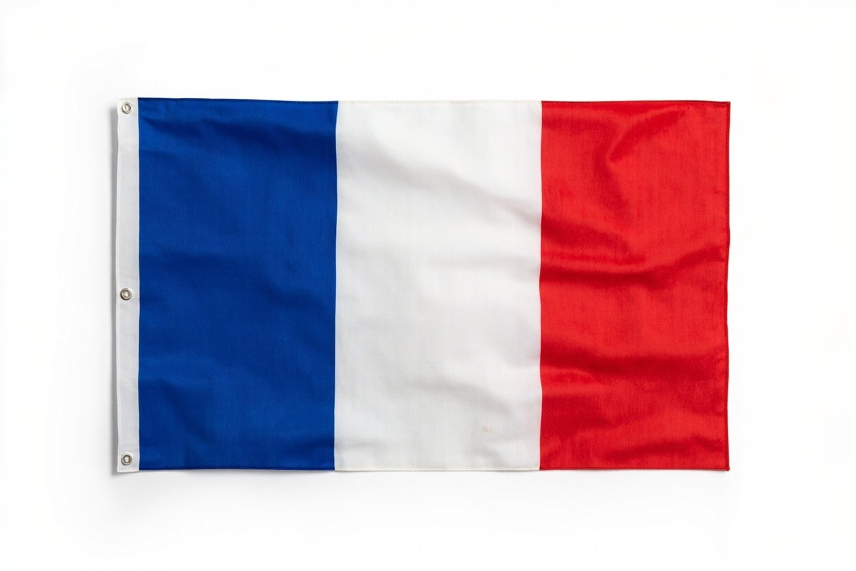
National flags are a special case. Official specifications often exist as yarn or fabric references rather than Pantone numbers, and shades vary between manufacturers and even between official sources. Where a country publishes a defined reference, we follow it; where it does not, we work from widely recognised Pantone approximations and confirm the intended look with you before production.
Talk to Us About Your Colours
If colour accuracy matters for your project — and for flags, it usually does — send us your Pantone references and a short note about how the flag will be used. We will advise on the most suitable printing method, the fabric that best supports your colours, and whether a physical proof makes sense for your order.
Browse custom flag options and share your artwork at flags-factory.com — our team is ready to help you get the colour right the first time.
Email: flagswin@flag-win.vip
WhatsApp: +86 13031678795
Facebook: https://www.facebook.com/StarFlagFactory/
Alibaba.com: https://wfqyflag.en.alibaba.com/
